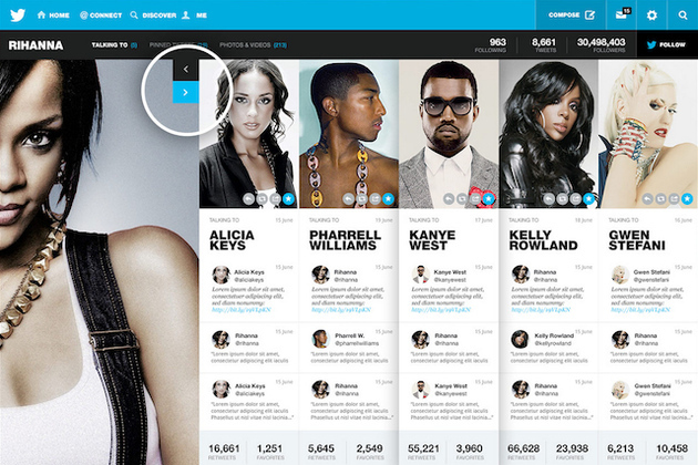
Twitter's website makes it really easy to see updates from the people who you're following — but that's about it. Digging into another person's profile still lands you in a mess of replies, without any clear way to get a sense of what they're up to. Designer Fred Nerby has some ideas for how to change that: he's mocked up a conceptual design for Twitter that would make profile pages into a hotspot of content to be explored, highlighting everything from a user's popular conversations to their latest videos and best tweets.
via The Verge - All Posts http://www.theverge.com/2013/8/1/4578276/fred-nerby-twitter-concept-redesign
No comments:
Post a Comment